 Download PDF
Part 10 - Learning from the Visual Builder
The Prima toolkit includes a built-in visual form designer that lets you create user interfaces, eliminating the need to write UI code by hand. It functions much like other 'drag-and-drop' builders: you can place buttons, text boxes, and other widgets onto your window with a click. Adding commands or event handlers to widgets is straightforward as well. You can save your designs to a file and later open them either in your application.
While I don’t personally use the Visual Builder in my workflow, I explored it for the purpose of this guide and discovered a few things that you might find useful.
24.1 What Can It Teach You?
When you design a UI in Prima’s Visual Builder and export it as a
- How Prima widgets are instantiated
- How widget properties are configured
- How layout and parent-child relationships are managed
- What defaults are automatically assumed or omitted
- How callbacks and event bindings are connected
This makes the Visual Builder a helpful tool for both rapid prototyping and learning the structure of Prima-based GUIs.
24.2 Learning from the Object Inspector
When you open Visual Builder, you’ll see three main windows:
- Main Panel
- Form Window (where your widgets appear)
- Object Inspector (this one is especially useful for learning)
The Object Inspector shows the settings and behaviors of whatever widget you select - like a button or a text box.
How to Use It:
- First, add a widget (like a button) to the Form Window.
- Then, look at the left side of the Inspector. It shows either a list of properties (like size or color) or events (click the button below the list to switch between viewing properties and events.).
- The right side shows the current value or code for the item you selected, e.g.
$self = $_[0] .
This is a great way to explore and learn how different widgets work. Just pick something (like a button), then explore its properties and events.
The following screenshots will make this clearer.
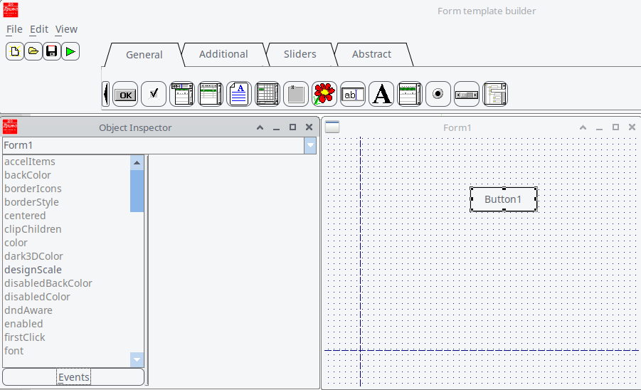
Figure 24.1: VB with Button Properties on the Left Side
Select property
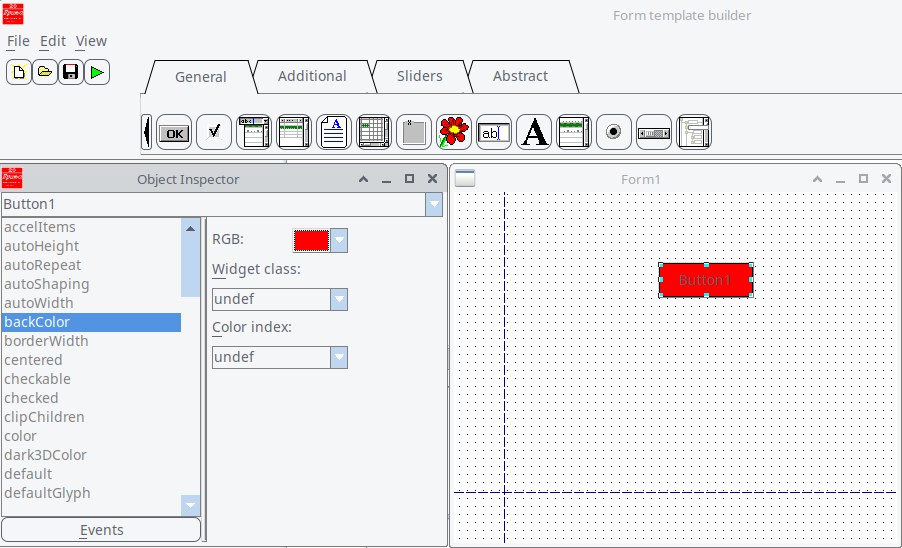
Figure 24.2: VB Using the Property backColor
Click Events below, you’ll see a new list. Click the item
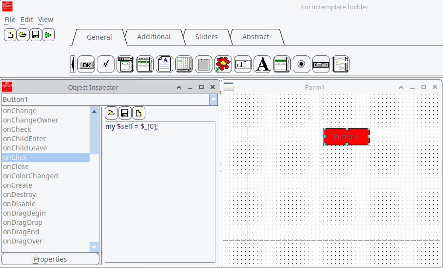
Figure 24.3: VB with Button Events on the Left Side
...and you learn the code my
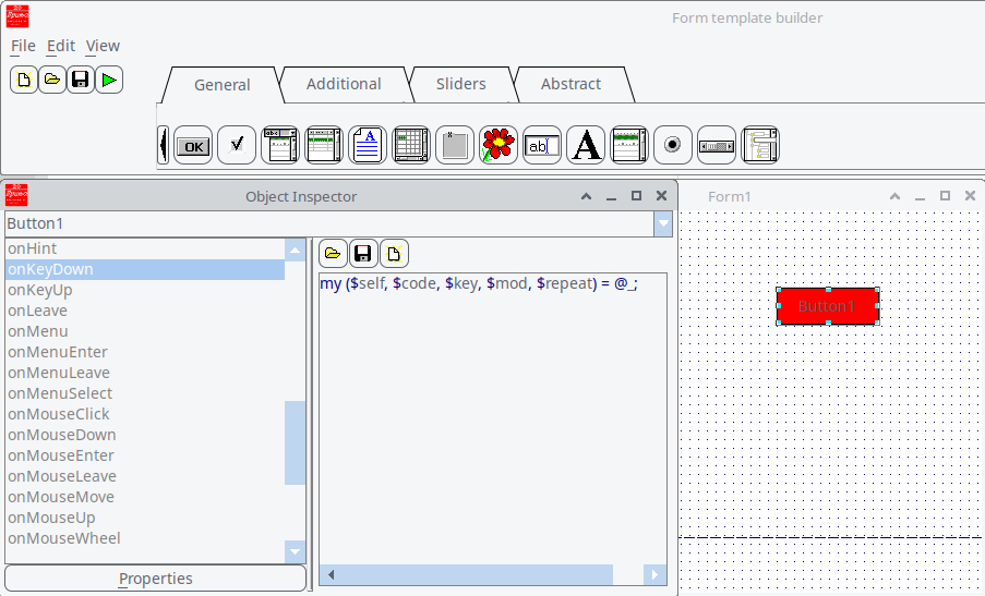
Figure 24.4: VB with Button Events on the Left Side; selecting onKeyDown Displays Information About the @_ array.
In this way, you can learn useful codes.
24.3 Learning from ‘Save as’
From the menu, choose File > Save As, and select Program scratch (*.pl) as the file type. This generates code that includes
Here’s how this program works, in plain terms:
- It creates a graphical window using the Prima toolkit for Perl.
- The window contains one red button.
- When you click the button, the background of the window turns green.
It follows a standard GUI lifecycle:
- Get default settings (
profile_default ) - Build widgets (
init ) - Show the window and run the app (
Prima->run )
Below is the code, thoroughly annotated for clarity.
package Form1Window; # Load the Prima GUI toolkit use Prima; use Prima::Classes;# Declare this package as a subclass of Prima::MainWindow use base 'Prima::MainWindow';# Load support for Button widgets use Prima::Buttons;# This method provides default properties for the window. # It is automatically called during ->new to get the initial setup values. sub profile_default {# Get the default values from the superclass my $def = $_[0]->SUPER::profile_default;# Define our custom default properties for this window my %prf = ( designScale => [8, 19], # UI scaling factor (font, controls, etc.) name => 'Form1', # Internal name for the window widget origin => [496, 268], # Starting position on screen (X, Y) size => [607, 371], # Window dimensions (width x height) );# Merge our custom defaults into the inherited default hash @$def{keys %prf} = values %prf;# Return the merged default settings return $def; }# This method is called right after profile_default. # It sets up widgets and layout inside the window. sub init { my $self = shift;# Call the superclass's init method to complete base initialization my %profile = $self->SUPER::init(@_);# Prevent visual updates while adding widgets (for performance/smoothness) $self->lock;# Add a button to the window $self->insert('Prima::Button', name => 'Button1', # Internal widget name origin => [105, 324], # Position of button inside the window size => [96, 36], # Button size (width x height) backColor => 0xff0000, # Background color (red, in hex) onClick => sub { my $button = shift;# When the button is clicked, change the window background to green $button->owner->backColor(cl::Green); }, );# Allow screen updates again $self->unlock;# Return the initialization profile (optional, but good practice) return %profile; } package main;# Load the Prima application core (this sets up the app framework) use Prima::Application;# Create the main window. This calls: # 1. profile_default to get default values # 2. init to build the interface (e.g., button) Form1Window->new; Prima->run;
Listing 24.1: Package Form1Window and Package Main
However, the first click leaves white artifacts around the button after background color change. So I adapted the code.
onClick => sub { my $button = shift; my $owner = $button->owner; # Set new background color $owner->backColor(cl::Green);# Hide button to allow repaint under it $button->visible(0);# Force window redraw (including under the button) $owner->repaint;# Show the button again $button->visible(1); },
and
# Paint background
sub onPaint {
    my ($self, $canvas) = @_;
    $canvas->color($self->backColor);
    $canvas->bar(0, 0, $self->size);
}
The trick was forcing the button to hide temporarily so the background beneath it could repaint properly.
24.4 A little modification
Just for fun, I modified the code of 24.3 and added a right-click option. So:
- Left-click: changes background to green
- Right-click: resets background to white
If you want to try, add to
onMouseUp => sub {

        my ($button, $btn_code, $x, $y, $mod) = @_;
        return unless $btn_code == mb::Right;

        my $owner = $button->owner;

        # Reset background to white on right-click
        $owner->backColor(cl::White);
        $button->visible(0);
        $owner->repaint;
        $button->visible(1);
    },
24.5 How I Built a Custom Timer in Prima
Prima comes with a built-in timer class called
profile_default : sets up default settings (liketimeout => 1000 for 1-second intervals).init : sets up the actual behavior when the timer is created.
I also saw how Prima uses a
24.5.1 What is a notification in Prima?
A notification is an event that a widget or object can emit. It's similar to a signal or callback. You can assign a handler for it when you create the object (like
This structure made it very inviting to build my own version on top of it.
In
This tells Prima:
"This object can emit a Tick event, and it uses the default type of notification."
So when the timer interval passes, it internally calls:
This triggers your assigned handler. Where does this come from?
sub notify {
    my ($self, $notification, @args) = @_;
    my $handler = $self->can("on$notification");
    $self->$handler(@args) if $handler;
}
So when the timer fires, it says:
Which then calls:
If you assigned an
24.5.2 Creating My Subclass
I created a new package called
I also added some convenience methods:
start_timer : resets the counter and starts the timerstop_timer : stops the timerreset_timer : sets the counter back to 0elapsed : returns how many ticks have passed
Now, this custom timer is more than just a tick generator - it’s a mini time tracker I can drop into any Prima app.
24.5.3 Why This Helped Me Learn
By building my own subclass, I didn’t just write new code - I learned how Prima is structured. It showed me how components in Prima are designed to be extended: clean separation of defaults, initialization, and behavior. I also got hands-on practice with how event notifications work under the hood.
And the best part? My new timer works just like a built-in widget, but it does exactly what I need.
24.5.4 My Custom Timer
First an overview of the implemented methods and their purpose.
| Method | Purpose |
|---|---|
| Sets initial |
|
| Hooks up the |
|
| Returns how many ticks have passed | |
| Resets counter to 0 | |
| Resets and starts | |
| Stops the timer |
Table 24.1: Implemented Methods in the Custom Timer and Their Purposes
So let’s have a look at the code with some annotations. First the package definition:
package My::ElapsedTimer; use base 'Prima::Timer'; # Add a new notification type if needed (optional) my %RNT = ( %{Prima::Timer->notification_types}, Elapsed => nt::Default, ); sub notification_types { return \%RNT; }# Set default profile values sub profile_default { my $def = $_[0]->SUPER::profile_default; $def->{timeout} = 1000; # tick every 1 second $def->{elapsed} = 0; # track elapsed time return $def; }# Initialization code sub init { my ($self, %profile) = @_; $self->{elapsed} = 0;# Set up the ticking behavior $self->onTick(sub { $self->{elapsed}++; $self->notify('Elapsed'); # emit custom Elapsed event }); return $self→SUPER::init(%profile); }# Public method to access elapsed time sub elapsed { $_[0]->{elapsed} }# Reset timer count sub reset_timer { my $self = shift; $self->{elapsed} = 0; }# Convenience methods sub start_timer { my $self = shift; $self->reset_timer; $self->start; } sub stop_timer { my $self = shift; $self->stop; } 1;
Now use the subclass in your main script:
use Prima qw(Application Buttons Label);
use lib '.'; # or adjust to path where My/ElapsedTimer.pm is
use My::ElapsedTimer;

my $mw = Prima::MainWindow->new(
    text => 'Custom Timer Demo',
    size => [220, 150],
    icon => Prima::Icon->load('icon.png'),
    borderStyle => bs::Dialog,
    borderIcons => bi::SystemMenu|bi::TitleBar,
);
my $label = $mw->insert('Prima::Label',
    text   => 'Elapsed: 0',
    origin => [20, 80],
    size   => [200, 40],
    font   => { size => 16 },
);
my $button = $mw->insert('Prima::Button',
    text   => 'Start',
    origin => [20, 30],
    size   => [80, 30],
);
my $reset_button = $mw->insert('Prima::Button',
    text   => 'Reset',
    origin => [120, 30],
    size   => [80, 30],
);
my $timer;
$timer = My::ElapsedTimer->new(
    timeout => 1000,
    enabled => 0,
    onElapsed => sub {
        $label->text("Elapsed: " . $timer->elapsed);
    },
);
my $running = 0;
$button->onClick(sub {
    if ($running) {
        $timer->stop_timer;
        $button->text('Start');
        $running = 0;
    } else {
        $timer->start_timer;
        $button->text('Stop');
        $running = 1;
    }
});

$reset_button->onClick(sub {
    $timer->reset_timer;
    $label->text('Elapsed: 0');
});

Prima->run;
Listing 24.2: Package main My Custom Timer
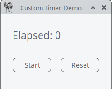
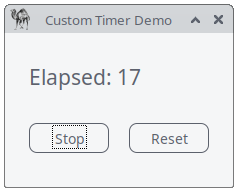
Figure 24.5: Custom timer in action
Closing Words and an Exercise!
One of the most powerful lessons I’ve learned - and continue to learn - is that true mastery comes from doing. Writing this guide, experimenting with Prima’s Visual Builder, and building custom components like the
Why "Learning by Doing" Works:
- Hands-On Exploration: The Visual Builder isn’t just a tool for creating UIs; it’s a playground for curiosity. By dragging, dropping, tweaking, and sometimes breaking things, I’ve uncovered nuances in Prima’s architecture that no documentation could fully capture.
- Iterative Improvement: The process of refining code—like fixing the repaint artifacts or adding right-click functionality—teaches resilience and adaptability. Each challenge is an opportunity to grow.
- Building Intuition: The more I experiment, the more intuitive Prima’s patterns become. What once seemed complex (like subclassing or event notifications) now feels like second nature.
A Daily Practice: I encourage you to adopt this mindset: spend a little time each day experimenting. Try modifying an existing example, building a small tool, or even just exploring the Object Inspector. Over time, these small efforts compound into deep understanding and confidence.
Final Encouragement: The journey of learning never truly ends—it evolves. Whether you’re a beginner or an experienced developer, there’s always something new to discover. Embrace the process, celebrate the small wins, and remember: every line of code you write is a step forward.
Now, go build something amazing!
Looking for a project idea? Build your own mini task-manager app!
1. Overview
The Mini Task Manager App is a simple yet functional application built using the Prima toolkit and its Visual Builder. This app allows users to manage tasks, track time spent on each task, and perform basic operations like adding, completing, and deleting tasks. It serves as a practical exercise to reinforce concepts such as UI design, event handling, and custom component integration.
2. Objectives
- Design a user interface using Prima’s Visual Builder.
- Implement event handlers for user interactions.
- Use a custom timer component to track task duration.
- Practice UI updates and repainting techniques.
- Create a functional, user-friendly application.
3. Functional Requirements
3.1. User Interface
Main Window: A window titled "Mini Task Manager" with a size of 400x300 pixels.
Task List: A
Prima::ListBox widget to display tasks.Buttons:
- Add Task: A button to add a new task.
- Complete Task: A button to mark the selected task as complete.
- Delete Task: A button to remove the selected task.
Timer Label: A
Prima::Label widget to display the elapsed time for the selected task.
3.2. Task Management
Add Task:
- Prompt the user to enter a task name using a dialog box.
- Add the task to the task list.
Complete Task:
- Mark the selected task as complete.
- Stop the timer for the task.
Delete Task:
- Remove the selected task from the task list.
- Stop the timer for the task.
3.3. Timer Functionality
- Start Timer: Start the timer when a task is selected.
- Stop Timer: Stop the timer when a task is completed or deleted.
- Display Elapsed Time: Update the timer label to show the elapsed time in seconds.
4. Non-Functional Requirements
4.1. Usability
- The UI should be intuitive and easy to navigate.
- Buttons should be clearly labeled.
- The task list should be easy to read and interact with.
4.2. Performance
- The app should respond quickly to user interactions.
- UI updates should be smooth and free of visual artifacts.
4.3. Code Quality
- The code should be well-structured and modular.
- Use comments to explain key sections of the code.
- Follow best practices for event handling and UI updates.
5. Technical Specifications
5.1. Tools and Libraries
- Prima Toolkit: Use Prima’s Visual Builder for UI design.
- Custom Timer: Use the
My::ElapsedTimer class for tracking task duration.
5.2. Code Structure
Main Window Class:
TaskManagerWindow (subclass ofPrima::MainWindow ).Methods:
profile_default : Set default properties for the window.init : Initialize UI components and event handlers.add_task : Add a new task to the list.complete_task : Mark the selected task as complete.delete_task : Remove the selected task.select_task : Start the timer for the selected task.stop_timer : Stop the timer and reset the timer label.
5.3. Event Handlers
- Button Clicks: Handle clicks for "Add Task," "Complete Task," and "Delete Task."
- Task Selection: Start the timer when a task is selected.
6. Deliverables
6.1. Source Code
- A Perl script (
task_manager.pl ) containing the complete implementation of the Mini Task Manager App.
6.2. Documentation
- A brief document explaining the app’s functionality, code structure, and how to run it.
6.3. Screenshots
- Screenshots of the app in action, showing the UI and timer functionality.
7. Evaluation Criteria
7.1. Functionality
- Does the app allow users to add, complete, and delete tasks?
- Does the timer correctly track and display elapsed time?
7.2. Usability
- Is the UI intuitive and easy to use?
- Are there any visual or functional issues?
7.3. Code Quality
- Is the code well-structured and modular?
- Are there comments explaining key sections?
7.4. Creativity
- Are there any additional features or improvements beyond the basic requirements?
8. Instructions for Students
- Design the UI: Use Prima’s Visual Builder to create the main window and add the required widgets.
- Implement Functionality: Write the code to handle task management and timer functionality.
- Test the App: Run the app and test all features to ensure they work as expected.
- Refine and Extend: Improve the UI and add any additional features you think would be useful.
- Submit Your Work: Provide the source code, documentation, and screenshots.
9. Conclusion
This exercise is designed to help you apply what you’ve learned about Prima’s Visual Builder, event handling, and custom components. By building the Mini Task Manager App, you’ll gain practical experience in creating functional and user-friendly applications. Good luck, and have fun coding!