 Download PDF
Part 11 – Miscellaneous Topics
These chapters gather a collection of useful Prima features that don’t quite fit into the main flow of the tutorial, yet are incredibly handy for beginners and intermediate users alike. They showcase practical, fun techniques that open up new possibilities and help your applications do even more. Think of this part as your “Prima toolbox”: small, focused skills you can plug into any project.
25. Markup in Widgets
Markup makes your UI richer: colored labels, styled text, icons inside text widgets. You will love this because it immediately improves appearance (as you already saw). Markup works in all text-bearing widgets, including:
Label Button Radio /CheckBox GroupBox ListBox DetailedList StringOutline - Custom canvases via
text_out
- basic markup syntax
- nested formatting (B<>, I<>, U<>, C<color|text>, etc.)
- fonts via
F<> - superscript/subscript (S<>)
- placement and alignment (P<> and M<>)
- embedded images via IMAGES array +
I<> - usage inside widgets (Label, Button, ListBox, DetailedList, Outline, Canvas)
- BiDi support and rotated text
- tooltips and links (Lpod://…|text)
| Tag | Usage | Example |
|---|---|---|
| Bold | ||
| Italic | ||
| Underline | ||
| Colored text | ||
| Increase font size | ||
| Decrease font size | ||
| Non-wrappable text | ||
| Font selection by ID | ||
| Paragraph alignment | ||
| Tooltip or link | ||
| Move text position | ||
| Background color | ||
| Embedded image by ID | ||
| Superscript | ||
| Subscript |
Table 25.1 Markup tag reference table
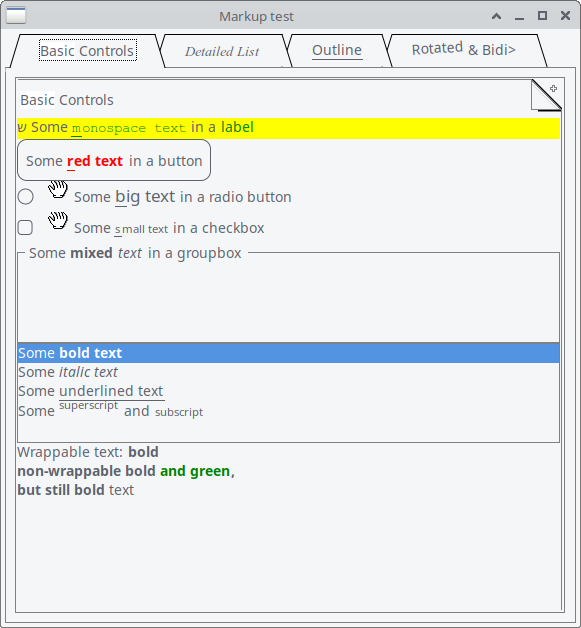
Figure 25.1 Basic Controls Markup Application
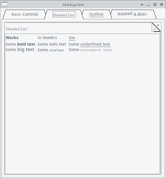
Figure 25.2 Detailed List Markup Application
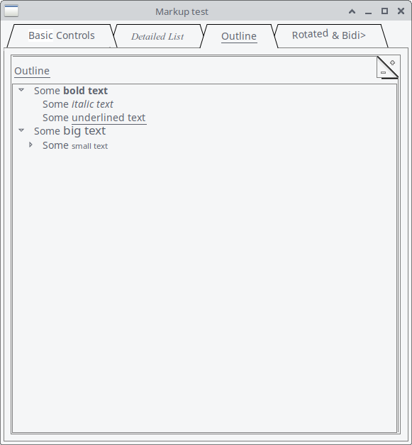
Figure 25.3 Outline Markup Application
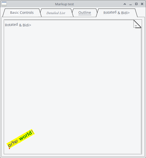
Figure 25.4 Rotated and bidi Markup Application
The following example brings all markup features together in one application.
# Load Prima modules for GUI widgets use Prima qw(Application Buttons Edit Notebooks Label DetailedList Outlines MsgBox); use FindBin qw($Bin);# Load Prima::Drawable::Markup, 'M' function helps convert strings to # markup objects use Prima::Drawable::Markup qw(M);# Structure of this listing # ----------------------------- # 1. Define available fonts # ----------------------------- # Each hash defines a font; direction can control RTL text @Prima::Drawable::Markup::FONTS = ( { name => 'Times New Roman' }, # index 0 { name => 'Courier New', direction => 4 }, # index 1 { name => 'Arial' }, # index 2 -> fixes F<2|Rotated> );# ----------------------------- # 2. Define images for markup # ----------------------------- # Images can be embedded inline with I<id> in markup @Prima::Drawable::Markup::IMAGES = (# Load a GIF from the script directory Prima::Icon->load("$Bin/Hand.gif") );# ----------------------------- # 3. Create main window # ----------------------------- my $Main = Prima::MainWindow->new( name => 'Main', text => 'Markup test', size => [500, 500], designScale => [7, 16], # Controls DPI scaling );# ----------------------------- # 4. Add a TabbedNotebook widget # ----------------------------- # Tabs demonstrate different markup and widgets my $tn = $Main->insert('TabbedNotebook', pack => { expand => 1, fill => 'both' }, tabs => [ M 'G<White|Basic> Controls', # Tab 0 M 'F<0|I<Detailed List>>', # Tab 1 M 'U<Outline>', # Tab 2 M 'F<2|Rotated> & Bidi>' # Tab 3 ], );# ----------------------------- # 5. Tab 0: Label with tooltip and monospace # ----------------------------- $tn->insert_to_page(0, 'Label', text => \ "\x{5e9} Some L<tip://$0/tip|F<1|U<m>onospace text>> " . "in a L<pod://Prima::Label/SYNOPSIS|label>", autoHeight => 1, hotKey => 'm', backColor => cl::Yellow, wordWrap => 1, focusLink => 'List', pack => { side => 'top', fill => 'x', anchor => 'w' }, );# Explanation: # \x{5e9} = Hebrew letter # L<tip://...|...> = clickable tooltip link # F<1|U<m>onospace text> = monospace font + underlined letter # ----------------------------- # 6. Tab 0: Button with markup and click action # ----------------------------- $tn->insert_to_page(0, 'Button', text => \ 'Some B<C<LightRed|U<r>ed text>> in a button', pack => { side => 'top', anchor => 'w' }, hotKey => 'r', onClick => sub { message(\ "Hello! This is the B<msgbox> speaking!") }, hint => \ "Hints can I<also> be markupified", );# Nested tags: Bold -> Colored -> Underlined -> Letter # ----------------------------- # 7. Tab 0: Radio button with big text # ----------------------------- $tn->insert_to_page(0, 'Radio', text => \ 'P<0>Some S<+2|U<b>ig text> in a radio button', pack => { side => 'top', anchor => 'w' }, hotKey => 'b', );# S<+2|…> increases font size, U<b> underlines 'b' # ----------------------------- # 8. Tab 0: CheckBox with small text # ----------------------------- $tn->insert_to_page(0, 'CheckBox', text => \ 'P<0>Some S<-2|U<s>mall text> in a checkbox', pack => { side => 'top', anchor => 'w' }, hotKey => 's', );# S<-2|…> decreases font size, U<s> underlines 's' # ----------------------------- # 9. Tab 0: GroupBox with mixed text # ----------------------------- $tn->insert_to_page(0, 'GroupBox', text => \ 'Some B<mixed> I<text> in a groupbox', pack => { side => 'top', fill => 'x' }, );# B<> = bold, I<> = italic # ----------------------------- # 10. Tab 0: ListBox with various markup # ----------------------------- $tn->insert_to_page(0, 'ListBox', name => 'List', focusedItem => 0, items => [ M 'Some B<bold text>', M 'Some I<italic text>', M 'Some U<underlined text>', M 'Some S<+2|big text> M<,-0.4,m> and S<-2|subscript>', ], pack => { side => 'top', fill => 'x' }, );# Demonstrates bold, italic, underline, big/small text, superscript/subscript # ----------------------------- # 11. Tab 0: Wrappable label with nested markup # ----------------------------- $tn->insert_to_page(0,'Label', wordWrap => 1, pack => { side => 'top', fill => 'both', expand => 1 }, )->text( \ "Wrappable text: B<bold W<non-wrappable bold C<Green|and green>>, but still bold> text" );# W<> prevents line wrapping, C<Green|…> colors text # ----------------------------- # 12. Tab 1: DetailedList with headers and markup # ----------------------------- $tn->insert_to_page(1,'DetailedList', headers => [ M 'B<Works>', M 'in I<headers>', M 'U<too>'], items => [ [ M 'Some B<bold text>', M 'Some I<italic text>', M 'Some U<underlined text>' ], [ M 'Some S<+2|big text>', M 'Some S<-2|small text>', M 'Some F<1|monospace text>' ], ], columns => 3, pack => { expand => 1, fill => 'both' }, );# Demonstrates markup in headers and table cells # ----------------------------- # 13. Tab 2: StringOutline with nested markup # ----------------------------- $tn->insert_to_page(2,'StringOutline', items => [ [ M 'Some B<bold text>', [ [ M 'Some I<italic text>'], [ M 'Some U<underlined text>'], ]], [ M 'Some S<+2|big text>', [ [ M 'Some S<-2|small text>', [ [ M 'Some F<1|monospace text>' ], ]], ]], ], pack => { expand => 1, fill => 'both' }, );# Nested outline items with bold, italic, underline, size, and monospace # ----------------------------- # 14. Tab 3: Custom widget with canvas painting # ----------------------------- $tn->insert_to_page(3,'Widget', font => { size => 16, direction => 30, name => 'Arial' }, pack => { expand => 1, fill => 'both' }, text => \ "G<Yellow|B<I<\x{5E9}\x{5DC}\x{5D5}\x{5DD}> C<Green|world>>!>", onPaint => sub { my ($self, $canvas) = @_; $canvas->clear; my ($ox, $oy) = (20, 20); $canvas->text_out($self->text, $ox, $oy); $canvas->color(cl::LightRed); $canvas->fill_ellipse($ox, $oy, 5, 5); }, );# Demonstrates direct canvas painting with markup # Nested tags: Yellow background, bold + italic Hebrew letters, green word # ----------------------------- # 15. Run the Prima application # ----------------------------- Prima->run; =pod =head1 tip This is a tooltip! =cut
Listing 25.1: Markup Application
26. Clipboard
Use
26.1 Copying Text to the Clipboard
This next example is a very easy one to demonstrate how the class works.
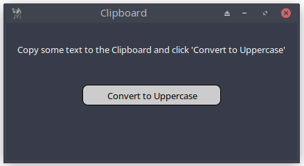
Figure 26.1: Clipboard Application
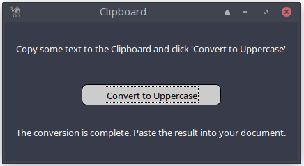
Figure 26.2: Copying Text to the Clipboard
This minimal program shows the absolute basics of reading and writing text to the clipboard.
use Prima qw(Label Buttons Application);

my $mw = Prima::MainWindow->new(
    text => 'Clipboard',
    size => [420, 200],
    backColor => cl::Gray,
    font => { size => 10, },
    icon => Prima::Icon->load('icon.png'),
    borderStyle => bs::Dialog,
    borderIcons => bi::SystemMenu|bi::TitleBar,
);

my $intro_label = $mw->insert( Label =>
    origin => [0,110],
    size => [$mw->width, 60],
    text => "Copy some text to the Clipboard and click " .
            "'Convert to Uppercase'",
    alignment   => ta::Center,
    color => cl::White,
    backColor => cl::Gray,
    ownerFont => 1,
);

my $output_label;
my $success = "The conversion is complete. Paste the result into " .
              "your document.";
my $error = "Nothing to convert...";

my $convert_button = $mw->insert( Button =>
    origin => [($mw->width/2)-(200/2), 80],
    size      => [200, 30],
    text      => "Convert to Uppercase",
    ownerFont => 1,
    color     => 0x000000,
    backColor => 0xcccccc,
    onClick   => sub {
                           $output_label->visible(0);
                           my $c = $::application->Clipboard;
                           my $str = $c->text;
                           if ($str =~ /[a-z]/) {
                              $c->text(uc($str));
                              $output_label->text($success);

                           } else {
                               $output_label->text($error);
                           }
                           $output_label->visible(1);
                        },
);

$output_label = $mw->insert( Label =>
    origin => [0, 0],
    size => [$mw->width, 50],
    text => '',
    alignment => ta::Center,
    wordWrap => 1,
    color => cl::White,
    visible => 0,

    ownerFont => 1,
);

Prima->run;
Listing 26.1: Copying Text to the Clipboard
26.2 Copying Images to the Clipboard
In the following program, we use the
The

Figure 26.3: Copying Images to the Clipboard
use Prima qw(Application Dialog::FileDialog); my $c = $::application->Clipboard; my $mw = Prima::MainWindow->new( text => 'Clipboard Tool: Image', size => [300, 200], font => { size => 10, }, icon => Prima::Icon->load('icon.png'), borderStyle => bs::Dialog, borderIcons => bi::SystemMenu|bi::TitleBar, ); my $result_label = $mw->insert( Label => origin => [5, 25], size => [290, 60], text => "", alignment => ta::Center, autoHeight => 1, wordWrap => 1, ownerFont => 1, ); $mw->insert(Button => origin => [30, 125], size => [250, 30], text => 'Open Image & Copy to Clipboard', ownerFont => 1, onClick => sub { $result_label->text(""); my $file_dialog = Prima::Dialog::OpenDialog->new( filter => [['Image files' => '*.bmp;*.gif;*.jpg;*.jpeg;*.png']], multiSelect => 0, # default value is 1, only for demonstration purpose sorted => 1, ); if ($file_dialog->execute) { my $image_path = $file_dialog->fileName; my $image = Prima::Image->load($image_path); if ($image) {# Copy image to clipboard my $img = $c->image( $image ); $result_label->text("Image $image_path copied to " . "clipboard! Paste it using Ctrl+V " . "in a compatible application."); } else { $result_label->text("Failed to load the image."); } } }, ); Prima->run;
Listing 26.2: Copying Images to the Clipboard
Interesting feature is creating Help button in the FileDialog
my $file_dialog = Prima::Dialog::OpenDialog->new(
    filter => [['Image files' => '*.bmp;*.gif;*.jpg;*.jpeg;*.png']],
    multiSelect => 0,
    showHelp => 1,
    helpContext => "pod.pl",
);
wherewhere pod.pl is defined as:
=pod

=head1 HELP

Select a file or type a filename and click the button 'Open'.

=cut
26.3 Notes on Custom Clipboard Formats
Besides text and images, the clipboard in Prima can also store custom data formats. These are mainly useful when two Prima applications want to exchange their own internal data, such as settings or structured information. Each custom format is identified by a name and is ignored by other programs that do not understand it.
For most beginners and everyday applications, working with plain text and images is more than enough. Custom formats are simply there as an extra option if, later on, you build more advanced tools that need to copy and paste specialized data.
27. Calendar - A Selectable Date Widget
The
- enable or disable locale support
- respond to date changes
- reset the calendar to today
- change the first day of the week
- attach calendar behavior to menu items
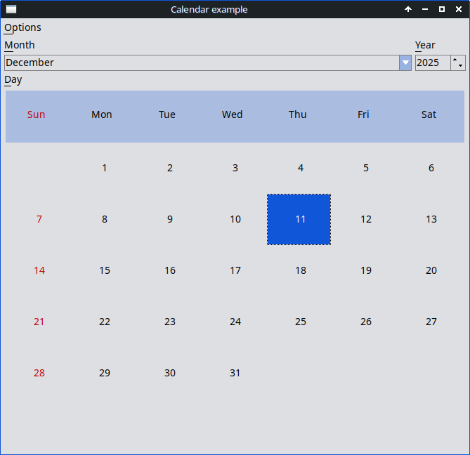
Figure 27.1: Calendar
This widget is ideal for date selection, schedules, reminders, or small tools that need date input.
# examples/calendar.pl - Standard calendar widget # # Demonstrates usage of Prima::Calendar, menu integration, locale switching, # and reacting to date selection changes. use Prima; use Prima::Application name => 'Calendar'; use Prima::Calendar; my $cal; # calendar widget (declared here so menu callbacks can see it)# Create main window with a menu bar for controlling the calendar. my $w = Prima::MainWindow->new( text => "Calendar example", size => [ 500, 500 ],# scale for fonts/layout (not critical for logic) designScale => [6,16],# Menu with options affecting the calendar widget. menuItems => [[ "~Options" => [# Toggle locale-based month/day names. [ '@locale', 'Use ~locale', 'Ctrl+L', '^L', sub { my ( $self, $mid, $val ) = @_; my $newstate;# attempt to enable/disable locale $cal->useLocale( $newstate = $val );# force calendar redraw $cal->notify(q(Change));# If enabling locale failed, uncheck the menu item and # warn the user. return unless $newstate && !$cal->useLocale; $self->menu->uncheck($mid); Prima::message("Selecting 'locale' failed"); }],# Reset calendar to today's date. [ 'Re~set to current date', 'Ctrl+R', '^R', sub { $cal->date_from_time( localtime(time) ); }],# Toggle Monday as the first day of the week. [ '@monday', '~Monday is the first day of week', sub { my ( $self, $mid, $val ) = @_; $cal->firstDayOfWeek($val); }], ]]], );# Insert the calendar widget into the main window. $cal = $w->insert( Calendar => useLocale => 1, # try using locale formatting at startup# When the selected date changes, update the window title. onChange => sub { $w->text( "Calendar - " . $cal->date_as_string ); }, pack => { expand => 1, fill => 'both' }, # fill window space );# If locale support is active, reflect it in the menu. $w->menu->locale->check if $cal->useLocale; Prima->run;
Listing 27.1: Calendar
28. Spinner - A Simple Animated Widget
The

Figure 28.1 Spinner
Spinners don’t track real time: the animation is purely visual. You control the speed and phase manually.
# examples/spinner.pl - standard spinner widget # # Demonstrates several spinner styles and basic interaction: # - starting/stopping animation # - changing spinner value # - embedding a slider inside a spinner use Prima qw(Application Buttons Spinner Sliders);# Create the main application window. my $mw = Prima::MainWindow->new( size => [400, 400], text => 'Spinners' );# First spinner: circular style, custom colors. my $spinner = $mw->insert('Spinner', style => 'circle', # choose animation style color => cl::Blue, # main color hiliteColor => cl::White, # highlight color pack => { side => 'left', fill => 'both', expand => 1 }, );# Second spinner: "drops" animation style. my $spinner2 = $mw->insert('Spinner', style => 'drops', color => cl::Green, pack => { side => 'left', fill => 'both', expand => 1 }, );# Third spinner: "spiral" style, default colors. my $spinner3 = $mw->insert('Spinner', style => 'spiral', pack => { side => 'left', fill => 'both', expand => 1 }, );# Button that toggles (starts/stops) ALL spinners. $mw->insert( 'Button', text => \ 'C<Green|U<S>tart>/C<Red|Stop>', hotKey => 's', checkable => 1, # works like an ON/OFF switch checked => 0, # start in "off" state origin => [0,0], onClick => sub { $_->toggle for $spinner, $spinner2, $spinner3; # toggle animations }, growMode => gm::XCenter, );# Slider INSIDE the first spinner: controls its animation position. $spinner->insert( 'Slider', min => 0, max => 100, # full animation cycle current => 1, # starting value origin => [0,0], onChange => sub { $spinner->value( shift->value ); # update spinner phase }, growMode => gm::XCenter, ); Prima->run;
Listing 28.1: Spinner
Closing Words
In this final part, you explored a collection of smaller yet powerful features that broaden what your applications can do. Markup gives your widgets expressive formatting, the clipboard enables smooth interaction with the system, and the calendar and spinner widgets offer convenient ways to select dates or animate small interface elements.
These topics may seem diverse, but together they highlight the flexibility and reach of the Prima toolkit. They let you refine your applications, polish the user experience, and add the finishing touches that make software feel complete.
With this, you’ve reached the end of the book’s journey. You now have the knowledge to build interfaces that are practical, dynamic, and thoughtfully designed. The next step is yours: experiment, create, and shape Prima into the applications you imagine.
And browse the full Prima examples folder - it’s a treasure chest of ideas. There is much more to discover!