 Download PDF
Part 6 - Layout and Interface Organization
16. Organizing Widgets Spatially
Chapter 16 presents tools for arranging widgets within an application’s interface:
- 16.1 Using Containers and Pack Introduces the use of container widgets and the Pack geometry manager to control basic spatial layout.
- 16.2 Static Multi-Pane Layouts Describes methods for creating fixed multi-pane interfaces that remain consistent in structure.
- 16.3 Dynamic Panes with FrameSet Explains how FrameSet enables resizable and adjustable pane layouts for more flexible interfaces.
16.1 Using Containers and Pack
You can use the
Let’s experiment with

Figure 16.1: A Horizontal Centered Label
use Prima qw(Application Label);

my $mw = Prima::MainWindow->new(
    text => 'Centering a label',
    size => [400, 300],
    icon => Prima::Icon->load('icon.png'),
);

my $label = $mw->insert(Label =>
    text => 'Centered Label',
    size => [110, 20],
    pack => {
        side   => 'top',
        # Increased padding to move the label up, decrease to move down
        pady   => 150,
    },
);

Prima->run;
Listing 16.1: A Horizontal Centered Label
When you resize the window, the
Let’s add two buttons at the bottom. Notice that we define a container for the buttons!
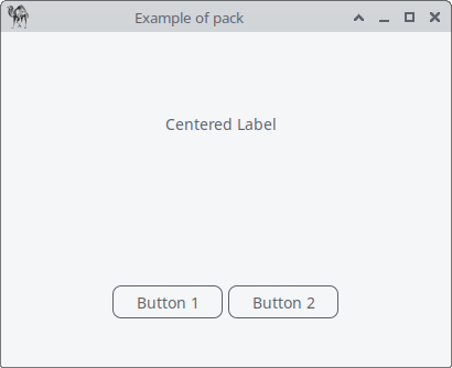
Figure 16.2: A Horizontal Centered Label and Buttons
use Prima qw(Application Label Buttons); my $mw = Prima::MainWindow->new( text => 'Example of pack', size => [400, 300], icon => Prima::Icon->load('icon.png'), ); my $label = $mw->insert( Label => text => 'Centered Label', size => [110, 20], # Increased padding to move the label up, decrease to move down pack => { side => 'top', pady => 150 }, );# Creating a widget as a container for buttons my $button_container = $mw->insert( Widget =># Increased padding to move the button container up, decrease to move down pack => { side => 'bottom', pady => 80 }, );# Adding two buttons next to each other in the button container my $button1 = $button_container->insert( Button => text => 'Button 1', size => [100, 30], pack => { side => 'left', padx => 5 }, ); my $button2 = $button_container->insert( Button => text => 'Button 2', size => [100, 30], pack => { side => 'left', padx => 5 }, ); Prima->run;
Listing 16.2: A Horizontal Centered Label and Buttons
When you resize the window, the
Remember these
| Tip | How to Do It | Example |
|---|---|---|
| Stack vertically | Labels, buttons in a column | |
| Place horizontally | Buttons in a row | |
| Mix directions | Use containers for different sections | Label on top, buttons at bottom |
| Add padding | Extra space around widgets | |
| Center widgets | Centered labels or buttons |
Table 16.1 pack tips
Using
- Pixel-perfect placement: when you need a widget at an exact
(x, y) position (e.g., a custom-drawn background or a fixed overlay). - Complex or static designs: if your layout doesn’t need to adapt to resizing,
origin gives you full control.
But if you need responsive designs, e.g. if your window resizes,
16.2 Static Multi- Pane Layouts
The pack layout manager is a simpler and more traditional tool for arranging widgets within their parent container (e.g., window) according to packing options like top, left, right, or bottom. If your layout doesn't require resizable sections and you just need to organize widgets in a straightforward, stacked, or aligned manner - either vertically or horizontally- pack is easy to use and works well for this purpose.

Figure 16.3: Multipane Interface
use Prima qw(Application Label ComboBox ); my %colors = ( 'black' => 0x000000, 'white' => 0xFFFFFF, 'maroon' => 0x800000, 'red' => 0xFF0000, 'purple' => 0x800080, 'green' => 0x008000, ); my $mw = Prima::MainWindow->new( text => "Static multi-pane interface", size => [600,300], icon => Prima::Icon->load('icon.png'), ); my $g1 = $mw->insert( Widget => pack => { side => 'left', fill => 'both', expand => 1 }, size => [$mw->width/2, $mw->height], backColor => 0x000000, ); my $g2 = $mw->insert( Widget => pack => { side => 'left', fill => 'both', expand => 1 }, size => [$mw->width/2, $mw->height], backColor => cl::White, ); $g1->insert( Label => pack => { fill => 'none', side => 'top', pady => 15 }, text => "Color picker", alignment => ta::Center, font => { size => 14, }, color => cl::White, ); $g1->insert( ComboBox => # fill => 'none': do not stretch the ComboBox; keep its natural width. # side => 'top': put it at the top of the container $g1. # pady => 15: add 15 pixels of vertical space above and below the widget. pack => { fill => 'none', side => 'top', pady => 15 }, size => [200, 30], items => [ 'black', 'white', 'maroon', 'red', 'purple', 'green' ],# when the program starts, "white" is shown by default. text => 'white',# cs::DropDown means it shows a dropdown list and lets the user type # their own text if needed. style => (cs::DropDown), onSelectItem => sub {# my ($cb) = @_; $cb is the ComboBox object itself. my ($cb) = @_;# $cb->focusedItem: gets the index of the selected item in the # items array. my $idx = $cb->focusedItem;# $cb->items->[$idx]: converts the index to the actual string name # (e.g., "red"). # return unless defined $idx && $idx >= 0; my $name = $cb->items->[$idx]; setColorFrame($name); }, );# setColorFrame is a helper function that changes the background color of # $g2 (the right-side container). sub setColorFrame { my ($name) = @_; return unless defined $name && exists $colors{$name};# $g2->backColor( $colors{$name} ); sets $g2’s background to the # corresponding hex color from %colors. $g2->backColor( $colors{$name} ); } Prima->run;
Listing 16.3: Multipane Interface
16.3 Dynamic Panes with FrameSet
As already said, if your UI needs resizable sections where users can dynamically adjust the layout by dragging dividers (splitters) between frames, you should use the
16.3.1 FrameSet, Label and Widget
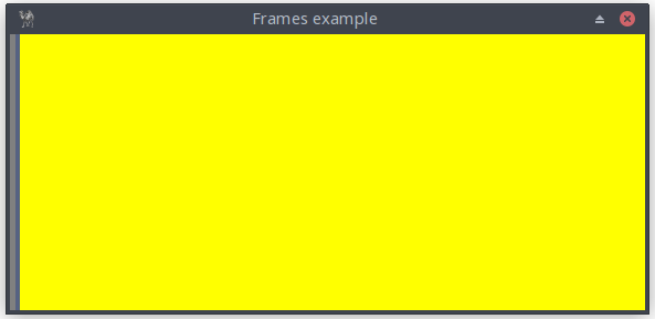
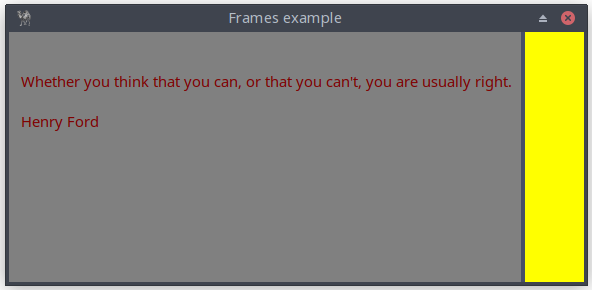
Figure 16.4: Dynamic Multipane Interface
use Prima qw( Label FrameSet Application );

my $mw = Prima::MainWindow->new(
    text   => "Frames example",
    size => [575, 250],
    icon => Prima::Icon->load('icon.png'),
    borderIcons => bi::SystemMenu,
);

my $frame = $mw->insert( FrameSet =>
    size => [$mw->size],
    origin => [0, 0],
    frameSizes => [qw(1% *)],
    flexible => 1,
    # 4 is default
    sliderWidth => 4,
);

$frame->insert_to_frame(
    0,
    Label =>
        pack => { expand => 1, fill => 'both', },
        text => "   \n\n   Whether you think that you can, or that you " .
                "can't, you are usually right.\n\n   Henry Ford",
        color => 0x800000,
        backColor => 0x808080,
);

$frame->insert_to_frame(
    1,
    Widget =>
        pack => { expand => 1, fill => 'both' },
        backColor => 0xFFFF00,
);

Prima->run;
Listing 16.4: Dynamic Multipane Interface
16.3.2 FrameSet and ImageViewer
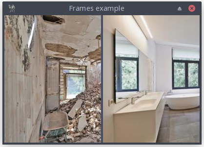

Figure 16.5: Dynamic Multipane Interface
use Prima qw( ImageViewer FrameSet Application ); # Load two images that will be displayed side by side. my $image_left = Prima::Image->load('Room-Construction-Before2.jpg') or die "$@" unless $image_left; my $image_right = Prima::Image->load('Room-Construction-After2.jpg') or die "$@" unless $image_right;# Create the main window sized to the first image. my $mw = Prima::MainWindow->new( text => "Frames example", width => $image_left->width, height => $image_left->height, icon => Prima::Icon->load('icon.png'), borderStyle => bs::Dialog, borderIcons => bi::SystemMenu | bi::TitleBar, );# ------------------------------------------------------------------- # FrameSet: a container that splits its area into adjustable panes. # # - frameSizes => [ '50%', '*' ] defines two frames: # Frame 0 = 50% of the width # Frame 1 = remaining space (“*”) # - flexible => 1 allows the user to drag the separator. # - separatorWidth => 1 sets a thin dividing line. # # This creates a vertical split with two resizable panels. # ------------------------------------------------------------------- my $frame = $mw->insert( FrameSet => size => [$mw->size], origin => [0, 0], frameSizes => [qw(50% *)], flexible => 1, separatorWidth => 1, );# Insert an ImageViewer into the left frame (frame index 0). # pack => { expand => 1, fill => 'both' } ensures the viewer # fills its entire pane and resizes with it. $frame->insert_to_frame( 0, ImageViewer => pack => { expand => 1, fill => 'both' }, image => $image_left, hScroll => 0, vScroll => 0, );# Insert the second image into the right frame (frame index 1). $frame->insert_to_frame( 1, ImageViewer => pack => { expand => 1, fill => 'both' }, image => $image_right, hScroll => 0, vScroll => 0, ); Prima->run;
Listing 16.5: Dynamic Multipane Interface
17. Structuring Your UI Logically
Chapter 17 presents three interface components that support clearer layout and organization:
17.1 GroupBox: Visual Grouping
Introduces the GroupBox widget, used to visually group related controls within a bordered frame and optional title.17.2 Notebook: Tabs for Complex Interfaces
Presents the Notebook widget, which provides tabbed pages for organizing content in more complex interfaces.17.3 Panel: Custom Borders and Backgrounds
Covers the Panel widget, a flexible container that supports custom borders, backgrounds, and visual adjustments.
17.1 GroupBox: Visual Grouping
This Perl program illustrates the use of containers and layout management in the Prima GUI toolkit. It shows how to organize widgets inside GroupBoxes, use nested containers for spacing and alignment, and control layout with the
The interface includes an Appearance GroupBox with exclusive radio buttons for theme selection, checkboxes for additional options, and a nested Advanced GroupBox to demonstrate horizontal alignment and vertical centering of child widgets. A status label dynamically displays the current selections, providing feedback while highlighting how widgets are packed and arranged within different containers.
This program serves as a practical example of how to structure a GUI with multiple levels of containers while maintaining clean layout and consistent spacing.

Figure 17.1: Groupbox
use Prima qw(Application Buttons Label MsgBox); # 1. Main Window my $w = Prima::MainWindow->create( text => 'Prima GroupBox - Live Preview', size => [520, 450], centered => 1, icon => Prima::Icon->load('icon.png'), );# 2. Preview Label my $preview = $w->insert(Label => text => "Current: Waiting for input...", pack => { side => 'top', fill => 'x', padx => 8, pady => 4 }, alignment => ta::Center, );# 3. GroupBox: Appearance my $gb = $w->insert(GroupBox => text => 'Appearance', pack => { side => 'top', fill => 'x', padx => 12, pady => 6 }, height => 300, );# spacer to move content below title $gb->insert(Label => text => '', pack => { side => 'top', fill => 'none', pady => 20 }); my %widgets;# 4. Theme Radio Buttons (exclusive) $widgets{light} = $gb->insert('Prima::Radio' => ( text => 'Light theme', pack => { side => 'top', fill => 'x', padx => 12, pady => 2 }, group => 1, # start radio group checked => 1, onClick => sub { update_preview($preview, \%widgets); }, )); $widgets{dark} = $gb->insert('Prima::Radio' => ( text => 'Dark theme', pack => { side => 'top', fill => 'x', padx => 12, pady => 2 }, onClick => sub { update_preview($preview, \%widgets); }, )); $widgets{system} = $gb->insert('Prima::Radio' => ( text => 'Use system theme', pack => { side => 'top', fill => 'x', padx => 12, pady => 2 }, onClick => sub { update_preview($preview, \%widgets); }, ));# 5. Checkboxes $widgets{shadows} = $gb->insert('Prima::CheckBox' => ( text => 'Enable shadows', pack => { side => 'top', fill => 'x', padx => 12, pady => 2 }, onClick => sub { update_preview($preview, \%widgets); }, )); $widgets{grid} = $gb->insert('Prima::CheckBox' => ( text => 'Show grid', pack => { side => 'top', fill => 'x', padx => 12, pady => 2 }, checked => 1, onClick => sub { update_preview($preview, \%widgets); }, ));# 6. Nested GroupBox (Advanced) my $advanced_gb = $gb->insert(GroupBox => text => 'Advanced', pack => { side => 'top', fill => 'x', padx => 12, pady => 6 }, );# small inner row for padding and centering my $adv_row = $advanced_gb->insert(Widget => pack => { side => 'top', fill => 'x', padx => 6, pady => 40 },#height => 28, ); $widgets{animated} = $adv_row->insert('Prima::CheckBox' => ( text => 'Animated transitions', pack => { side => 'left', padx => 8, pady => 1 }, onClick => sub { update_preview($preview, \%widgets); }, )); $widgets{high_contrast} = $adv_row->insert('Prima::CheckBox' => ( text => 'High contrast', pack => { side => 'left', padx => 8, pady => 1 }, onClick => sub { update_preview($preview, \%widgets); }, ));# 7. Buttons $w->insert(Button => text => 'Show selection', pack => { side => 'left', padx => 10, pady => 10 }, onClick => sub { my $theme = $widgets{light}->checked ? 'Light' : $widgets{dark}->checked ? 'Dark' : 'System'; my @opts; push @opts, 'shadows' if $widgets{shadows}->checked; push @opts, 'grid' if $widgets{grid}->checked; push @opts, 'animated' if $widgets{animated}->checked; push @opts, 'high contrast' if $widgets{high_contrast}->checked; my $opts = @opts ? join(', ', @opts) : 'none'; message_box("Info", "Selected:\nTheme: $theme\nOptions: $opts", mb::OK, compact => 1,); }, ); $w->insert(Button => text => 'Toggle group', pack => { side => 'left', padx => 10, pady => 10 }, onClick => sub { my $new = !$gb->enabled; $gb->enabled($new); $gb->text($new ? 'Appearance' : 'Appearance (disabled)'); }, ); $w->insert(Button => text => 'Quit', pack => { side => 'right', padx => 10, pady => 10 }, onClick => sub { exit }, );# 8. Update Preview Subroutine sub update_preview { my ($preview_label, $widgets) = @_;# Determine theme my $theme = $widgets->{light}->checked ? 'Light' : $widgets->{dark}->checked ? 'Dark' : 'System';# Collect options my @opts; push @opts, 'shadows' if $widgets->{shadows}->checked; push @opts, 'grid' if $widgets->{grid}->checked; push @opts, 'animated' if $widgets->{animated}->checked; push @opts, 'high contrast' if $widgets->{high_contrast}->checked; my $opts = @opts ? join(', ', @opts) : 'none';# Update preview $preview_label->text("Current: $theme theme, Options: $opts"); }# 9. Initialize Preview update_preview($preview, \%widgets); Prima->run;
Listing 17.1: Groupbox
17.2 Notebook - Tabs for Complex Interfaces
This Perl script showcases a tabbed interface designed to explore educational content about the Solar System. Its features:
It uses the
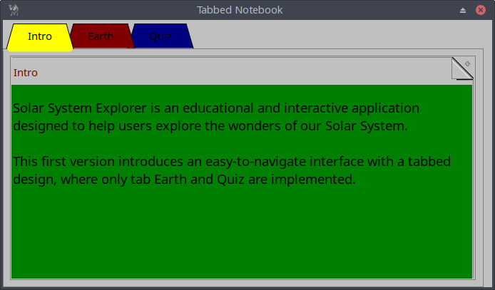
Figure 17.2: A Colored, Tabbed Notebook With Three Tabs
my $nb = $w->insert('Prima::TabbedNotebook' => pack => {side => 'left',}, size => [ 590, 300 ], color => cl::Red, tabs => [ 'Intro', 'Earth', 'Quiz', ], # settings of textcolor and backgroundcolor of notebook object, # part of TabbedNotebook notebookProfile => {color => cl::Black, backColor => cl::Green,},# default settings of the TABS tabsetProfile => {color => cl::Black, backColor => cl::LightGray},# each TAB has its own color colored => 1, colorset => [cl::Yellow, cl::Red, cl::Blue], );
Each TAB corresponds with a page. To populate the first page with a Label object, write:
# define the Label properties
my %intro = (
    origin => [2, 100],
    text => ($str1 . "\n\n" . $str2),
    autoHeight => 1,
    width => 550,
    wordWrap => 1,
    color => cl::Black,
    font => { size => 14, },
);
# insert_to_page INDEX, CLASS, %PROFILE, [[ CLASS, %PROFILE], ... ]
$nb->insert_to_page( 0, 'Prima::Label', %intro, ),
The page EARTH defines
The page EARTH also show how to make a hyperlink to a webpage.
The TAB Quiz offers an interactive quiz with multiple-choice questions about Earth. Users can answer questions, receive feedback, and navigate through a series of questions using a "Next question!" button.
is the code to populate the third page, where ‘insert_antwers’ is a method that generates four times array references
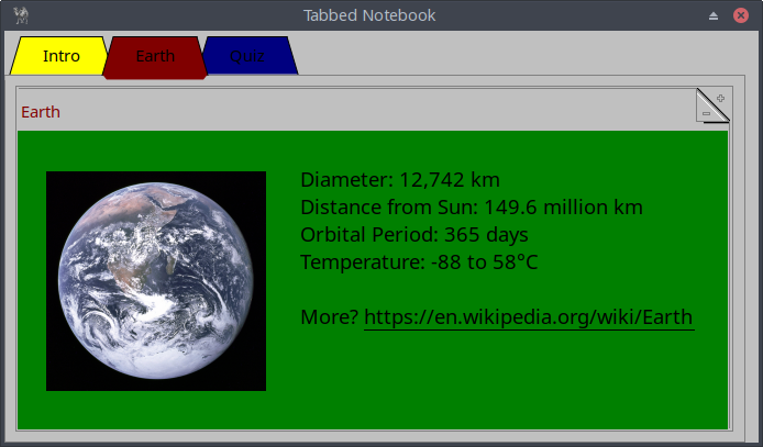
Figure 17.3: Tab Earth
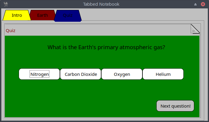
Figure 17.4: Tab Quiz
use Prima qw(Notebooks Buttons Label ImageViewer Application); use Prima::Drawable::Markup q(M); use lib '.'; require "showMessageDialog.pl"; my $w = Prima::MainWindow->new( name => 'Tabbed Notebook', size => [ 600, 300], designScale => [7, 16], backColor => cl::LightGray, color => cl::Black, icon => Prima::Icon->load('icon.png'), borderStyle => bs::Dialog, borderIcons => bi::SystemMenu|bi::TitleBar, ); my $nb = $w->insert('Prima::TabbedNotebook' => pack => {side => 'left',}, size => [ 590, 300 ], color => cl::Red, tabs => [ 'Intro', 'Earth', 'Quiz', ], tabsetProfile => {color => cl::Black, backColor => cl::LightGray}, notebookProfile => {color => cl::Black, backColor => cl::Green,}, colored => 1, colorset => [cl::Yellow, cl::Red, cl::Blue], ); #--------------------------------------------------------------------------- #first tab Solar System Explorer my $str1 = "Solar System Explorer is an educational and interactive " . "application designed to help users explore the wonders " . "of our Solar System."; my $str2 = "This first version introduces an easy-to-navigate interface " . "with a tabbed design, where only tab Earth and Quiz are implemented."; my %intro = ( origin => [2, 100], text => ($str1 . "\n\n" . $str2), autoHeight => 1, width => 550, wordWrap => 1, color => cl::Black, font => { size => 14, }, ); $nb->insert_to_page( 0, 'Prima::Label', %intro, ),#---------------------------------------------------------------------------#second tab Earth my $mc_image = Prima::Image->load('earth.png') or die "Cannot load image"; my %earth_image = (#pack => { side => 'left', fill => 'both' }, origin => [10, 8], size => [200, 200], image => $mc_image, valignment => ta::Center, alignment => ta::Center, backColor => cl::Green, );# my $degreeCelcius = "\x{00B0}"; my %key_facts = ( origin => [225, 70], linkColor => cl::Black, text => \ "Diameter: 12,742 km\nDistance from Sun: 149.6 million km\n" . "Orbital Period: 365 days\nTemperature: -88 to 58\x{00B0}C\n\nMore?" . "L<https://en.wikipedia.org/wiki/Earth|U<https://en.wikipedia.org/wiki/Earth>>", autoHeight => 1, font => { size => 14, }, color => cl::Black, ); $nb->insert_to_page( 1, ['Prima::ImageViewer',%earth_image], ['Prima::Label', %key_facts], ),#--------------------------------------------------------------------------- #third tab QUIZ my @quiz = ( { question => "How long does Earth take to orbit the Sun?", choices => ["225 days", "730 days", "365 days", "88 days"], answer => "365 days", }, { question => "What percentage of Earth's surface is covered in water?", choices => ["30%", "50%", "90%", "70%"], answer => "70%", }, { question => "What is the Earth's diameter?", choices => ["15,000 km", "12,742 km", "20,000 km", "10,000 km"], answer => "12,742 km", }, { question => "What is the Earth's primary atmospheric gas?", choices => ["Nitrogen", "Carbon Dioxide", "Oxygen", "Helium"], answer => "Nitrogen", }, { question => "What is the average distance of Earth from the Sun?", choices => ["108.2 million km", "57.91 million km", "149.6 million km", "778.5 million km"], answer => "149.6 million km", }, { question => "What is Earth's only natural satellite?", choices => ["Moon", "Io", "Europa", "Phobos"], answer => "Moon", }, { question => "What is the shape of Earth's orbit around the Sun?", choices => ["Circular", "Oval", "Triangular", "Elliptical"], answer => "Elliptical", }, { question => "What is the thickest layer of Earth?", choices => ["Inner Core", "Crust", "Outer Core", "Mantle"], answer => "Mantle", }, { question => "Which zone of Earth supports all life?", choices => ["Atmosphere", "Biosphere", "Hydrosphere", "Lithosphere"], answer => "Biosphere", }, { question => "What causes Earth's seasons?", choices => ["Gravity", "Rotation", "Axis tilt", "Sun distance"], answer => "Axis tilt", }, ); my $no_questions = scalar(@quiz);#my $rand = int(rand (scalar @quiz)); my $index = 0; my %q; sub insert_question { %q = ( origin => [0, 175], text => $quiz[$index]->{question}, size => [590, 60], alignment => ta::Center, autoHeight => 1, font => { size => 14, }, color => cl::Black, ); } sub evaluate { my ($i, $index) = @_; if ($quiz[$index]->{choices}->[$i] eq $quiz[$index]->{answer}) { showMessageDialog(250, 125, "Your answer is", "Correct!" ); } else { showMessageDialog(250, 125, "Your answer is", "Wrong..." ); } } $nb->insert_to_page( 2, 'Prima::Label', insert_question ); sub insert_answers { my $button_width = 120; my $x_position = 40; my $y_position = 100; my $space_between = 120; my @buttons;# Loop through choices to create the four buttons for my $i (0..3) { push @buttons, [ Button => origin => [$x_position + $i * $space_between, $y_position], size => [$button_width, 30], text => $quiz[$index]->{choices}->[$i], backColor => cl::White, color => cl::Black, onClick => sub { evaluate($i, $index); }, ]; } return @buttons; } $nb->insert_to_page( 2, insert_answers ); my %next_question_button = ( origin => [440, 15], size => [110, 30], name => "Next question!", backColor => cl::LightGray, color => cl::Black, onClick => sub { ($index < $no_questions -1) ? $index++ : ($index = 0); $nb->insert_to_page( 2, 'Prima::Label', insert_question ); $nb->insert_to_page( 2, insert_answers ); }, ); $nb->insert_to_page( 2, 'Prima::Button', %next_question_button ); Prima->run;
Listing 17.2: A Colored, Tabbed Notebook With Three Tabs
17.3 Panel: Custom Borders and Backgrounds
The Panel widget (
Panels are particularly useful when you want to:
- Group related controls visually.
A panel can hold several widgets (buttons, labels, sliders, etc.) that belong together, such as audio settings or file options. - Decorate or highlight a region.
Panels can display colored or image-based backgrounds, helping to separate content areas and improve clarity. - Add visual hierarchy.
By adjusting theraise andborderWidth properties, you can make a panel appear raised or sunken, providing visual depth. - Build reusable interface sections.
Panels can serve as self-contained units—such as toolbars, sidebars, or info boxes—that can be easily inserted into different parts of a program.
Main Properties
| Property | Type | Description | Default |
|---|---|---|---|
| INTEGER | Width of the 3D-shade border around the widget. | 1 | |
| OBJECT | Image object drawn as a tiled background. If |
||
| PATH | Image file to be loaded and displayed. Rarely used, since it does not return a success flag. | ||
| BOOLEAN | Border style: |
1 | |
| INTEGER | Zoom level for image display. Acceptable range: 1 – 10. | 1 |
Table 17.1: main properties of the Panel widget
17.3.1 Example 1: A Simple Decorative Panel
This creates a light blue, raised panel that contains a centered label. It visually groups content and provides a framed section of the interface.
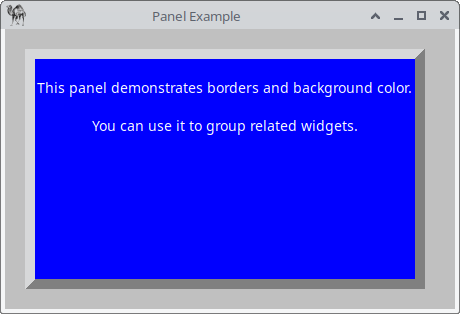
Figure 17.5: A Simple Decorative Panel
use Prima qw(Application Label Buttons);
use Prima::Widget::Panel;

my $mw = Prima::MainWindow->new(
    text => 'Panel Example',
    size => [450, 280],
    backColor => cl::LightGray,
    icon => Prima::Icon->load('icon.png'),
);

my $panel = $mw->insert( 'Prima::Widget::Panel',
    origin      => [20, 20],
    size        => [400, 240],
    borderWidth => 10,
    raise       => 1,
    backColor   => cl::LightBlue,
    text        => 'Information Panel',
);

$panel->insert( Label =>
      origin    => [10, 10],
      size      => [380, 200],
      text      => "This panel demonstrates borders and background color.\n\n"
                   .
                   "You can use it to group related widgets.",
      alignment => ta::Center,
      color     => cl::White,
);

Prima->run;
Listing 17.3: A Simple Decorative Panel
17.3.2 Example 2 – Reusable Panels (Toolbar and Sidebar)
This example uses two panels to define reusable layout regions:
- A toolbar (raised) containing buttons.
- A sidebar (sunken) for information.
Both panels can be copied or subclassed for use in other windows, showing how the panel serves as a modular building block in interface design.

Figure 17.6: Reusable Panels
use Prima qw(Application Buttons Label); use Prima::Widget::Panel; my $mw = Prima::MainWindow->new( text => 'Reusable Panels Example', size => [500, 350], icon => Prima::Icon->load('icon.png'), ); # Toolbar panel my $toolbar = $mw->insert( 'Prima::Widget::Panel', origin => [0, 310], size => [500, 40], name => 'Panel 1', borderWidth => 2, raise => 1, ); $toolbar->insert( Button => text => 'Open', origin => [10, 5], size => [80, 25], ); $toolbar->insert( Button => text => 'Save', origin => [100, 5], size => [80, 25], );# Sidebar panel my $sidebar = $mw->insert( 'Prima::Widget::Panel', name => 'Panel 2', origin => [0, 0], size => [120, 310], borderWidth => 3, raise => 0, ); $sidebar->insert( Label => text => "Information Panel\n(Status, Tips, etc.)", origin => [10, 220], size => [100, 60], wordWrap => 1, alignment => ta::Center, ); $mw->insert( Label => text => "Main Application Area", origin => [140, 140], size => [340, 60], alignment => ta::Center, wordWrap => 1, ); Prima->run;
Listing 17.4: Reusable Panels
Of course, you could use the backColor property to make the panels more discernible.
17.3.3 Do You Really Need a Panel?
17.3.3.1 A Status Bar
This application demonstrates several interactive elements—such as a button, combo box, checkbox, and spin edit input—each with a designated status bar, implemented as a
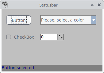
Figure 17.7: A Status Bar
use Prima qw(Application Label Buttons ComboBox Sliders);

my $mw = Prima::MainWindow->new(
    text => 'Statusbar',
    size => [325, 200],
    backColor => cl::LightGray,
    icon => Prima::Icon->load('icon.png'),
    borderStyle => bs::Dialog,
    borderIcons => bi::SystemMenu|bi::TitleBar,
);

my $statusbar;

$mw->insert( Button =>
origin => [15, 150],
    size => [80, 30],
    text => 'Button',
    onClick => sub { $statusbar->text("Button selected") },
);

$mw->insert( ComboBox =>
    origin => [125, 150],
    size => [180, 30],
    name => 'Please, select a color',
    items => [ 'Apricot', 'Beige', 'Black', 'Blue', ],
    style => (cs::DropDown),
    onChange => sub { $statusbar->text("ComboBox selected") },
);

$mw->insert( CheckBox =>
    origin => [15, 95],
    text => 'CheckBox',
    onClick => sub { $statusbar->text("Checkbox selected") },
);

my $inputline = $mw->insert( SpinEdit =>
    origin => [125, 100],
    width => 75,
    min => -459,
    max => 1000,
    editProfile => {color => cl::Black, backColor => cl::White},
    spinProfile => {backColor => cl::LightGray, color => cl::Black},
    onChange => sub { $statusbar->text("SpinEdit selected") },
);

$statusbar = $mw->insert( Label =>
    origin => [0,0],
    text => '',
    size => [ $mw->width, $mw->font->height + 2 ],
    growMode => gm::GrowHiX,
    borderWidth => 1,
    color => cl::Blue,
    backColor => cl::Gray,
);

Prima->run;
Listing 17.5: A Status Bar
17.3.3.2 A Status Window
A status window or message window is sometimes more useful for providing feedback. This application features again interactive elements—including a button, combo box, checkbox, and spin edit input—each providing feedback in a dedicated status window, implemented using the
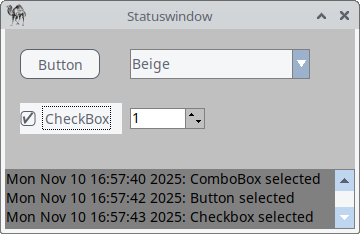
Figure 17.8: A Status Window
use Prima qw(Application Label Edit Buttons ComboBox Sliders);

my $statuswindow = '';
my $status_text = '';

sub update_statuswindow {
    my $datestring = localtime();
    $status_text .= "$datestring: $_[0]\n";
    $statuswindow->text($status_text);
}

my $mw = Prima::MainWindow->new(
    text => 'Statuswindow',
    size => [350, 200],
    backColor => cl::LightGray,
    icon => Prima::Icon->load('icon.png'),
    borderStyle => bs::Dialog,
    borderIcons => bi::SystemMenu|bi::TitleBar,
);

$mw->insert( Button =>
    origin => [15, 150],
    size => [80, 30],
    text => 'Button',
    onClick => sub { update_statuswindow("Button selected"); },
);

$mw->insert( ComboBox =>
    origin => [125, 150],
	size => [180, 30],
	name => 'Please, select a color',
	items => [ 'Apricot', 'Beige', 'Black', 'Blue', ],
	style => (cs::DropDown),
	onChange => sub { update_statuswindow("ComboBox selected"); },
);

$mw->insert( CheckBox =>
    origin => [15, 95],
    text => "CheckBox",
    onClick => sub { update_statuswindow("Checkbox selected"); },
);

my $inputline = $mw->insert( SpinEdit =>
    origin => [125, 100],
    width  => 75,
    min => -459,
    max => 1000,
    editProfile => {color => cl::Black, backColor => cl::White},
    spinProfile => {backColor => cl::LightGray, color => cl::Black},
    onChange => sub { update_statuswindow("SpinEdit selected"); },
);

$statuswindow = $mw->insert( Edit =>
    origin => [0,0],
    size => [ $mw->width, 60],
    text => '',
    color => 0x000000,
    backColor => cl::Gray,
    wordWrap => 1,
    hScroll => 0,
);

Prima->run;
Listing 17.6: A Status Window
17.3.4 When to Use (or Skip) a Panel?
| Situation | Use a Panel | Skip it |
|---|---|---|
| You want a framed, decorative section with multiple child widgets | ✅ Yes | |
| You only need to display or scroll text | ✅ Yes | |
| You want border or background control without extra logic | ✅ Yes | |
| You want lightweight performance and no border | ✅ Yes |
Table 17.2: use a Panel or skip it.
In short, the
Closing words
In this part you learned how to build the structural backbone of a Prima interface. Containers, the pack manager, and both static and dynamic panes give you precise control over how widgets relate to each other on the screen. GroupBox, Notebook, and Panel add clarity and hierarchy, allowing you to organize content in a way that is both functional and visually intuitive.